Lyric Analysis of an Artist

Introduction

This is a follow up post to the lyric analysis performed for the Billboard Hot 100 songs lyric analysis (referred to as - Billboard analysis). Within the Billboard analysis, I attempted to find trends within the lyrics that may influence why a particular song is popular. However, I did not find anything of interest. After no trends were found in the Billboard analysis, I wondered what I could find by analyzing every song performed by an artist. There is no particular trend of interest that I tried to find within an artist. This is purely an exploratory endeavor. All of the code associated with this pipeline can be found at the following Github repository.

Please take caution while reading this blog post. Some offensive language is used for analysis purposes.

Methods

In this section you will find the methods used to collect, cleanse, process and visualize the data. The image below represents the tasks associated with the entire data pipeline. It is a DAG (directed acyclic graph) of every task in the pipeline (created with Luigi).

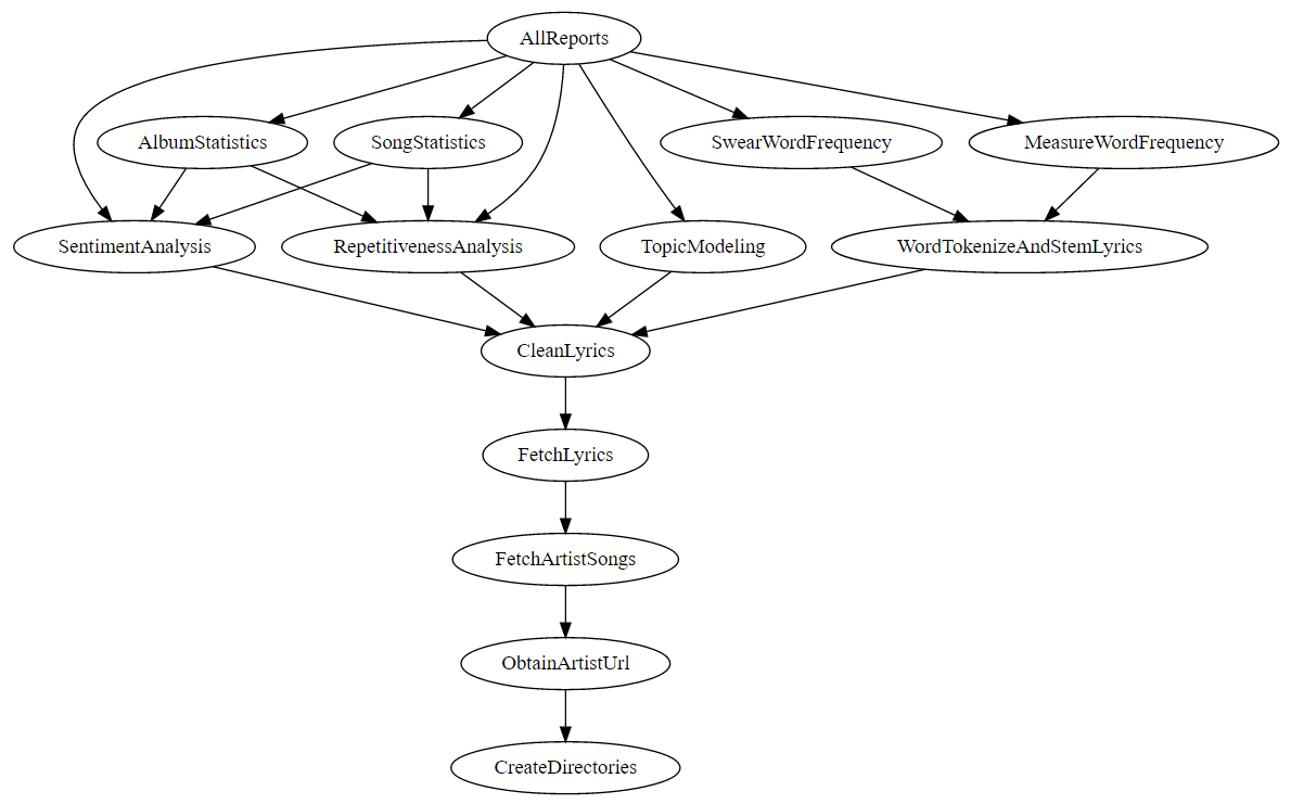
Figure 1. Data pipeline

The data pipeline takes an artist and an output directory as input. It then goes through the process of extracting lyrics, cleaning the lyrics, processing the lyrics and finally generating some visualizations. These processes are explained in further detail below.

Data Collection

The data collection process first searches for the artist provided as input on the site AZLyrics.com. If an artist shows in the search results, the pipeline further scrapes the website to obtain all songs available. These tasks, ObtainArtistUrl, FetchArtistSongs and FetchLyrics, are all performed using the Requests and LXML libraries available in the Python language. Prior to web scraping, the pipeline creates a directory structure in the CreateDirectories task to store data, plots and reports in a tidy fashion within the specified output directory. Similar to the Billboard analysis, the swear word list from no-swearing.com is used to look for curse words throughout the text.

Data Cleansing

Preparation of the lyrics files consisted of removing unwanted text within the files. Many of the files contained labels in brackets to mark the chorus and other constructs of a song. These were removed from the files. Additionally, some lyrics files had a line that consisted of "Produced by…" which was removed. All data cleansing techniques used regular expressions in the Python programming language. Prior to this data cleansing step, raw data analysis was performed to determine what was causing "dirty results".

Text Processing and Visualization

The Python language and the following libraries were used to process and visualize the text: NLTKPandasMatplotlib and Scikit-learn. NLTK is a natural language processing tool kit that provides convenience functions for common tasks such as tokenization and sentiment analysis. The Pandas library is a tool that provides common data analysis features. It enables you to easily perform aggregations, obtain descriptive statistics and plot data by wrapping convenience methods from other libraries. When Pandas didn't provide the exact plotting styles that I wanted out of the box, I used Matplotlib functionality to add styling to the plots. Scikit-learn was used to extract TF-IDFs (term frequency–inverse document frequency) and to perform topic modeling. TF-IDF is essentially a statistical measure of how important a word is within a given document. Topic modeling is a method that tries to find semantic meanings within a set of given text. In this analysis we use two different topic modeling algorithms; LDA and NMF.

Analysis

In this section we look at the output of the data pipeline for the artists Twenty One Pilots and Eminem. These two artists were chosen to illustrate potential insights that can be gained from artists. Additionally, these two artists come from two different genres; pop and rap.

Many of these techniques have already been explained in the Billboard analysis and are left out for brevity. I encourage you to read that blog post to learn more about the techniques.
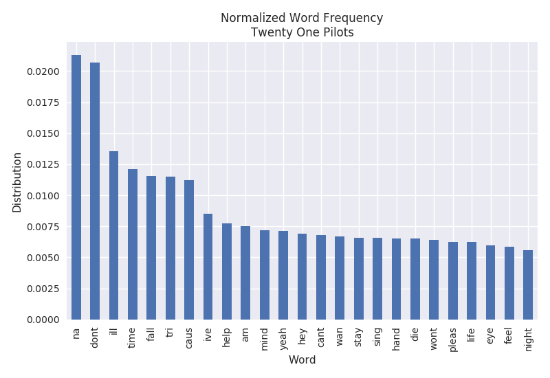
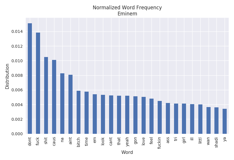
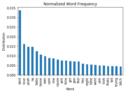
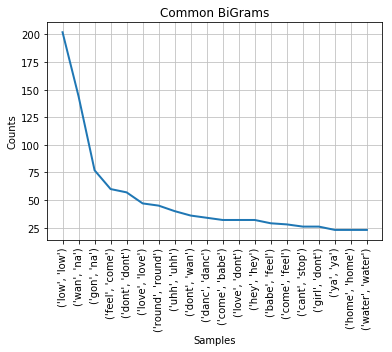
Word Frequency

The word frequency represents the most common words found throughout all of the lyrics. It is normalized by the number of words in each document and the total number of songs observed. Comparing the artists below, we can see that Eminem has a tendency to swear a lot while Twenty One Pilots does not.

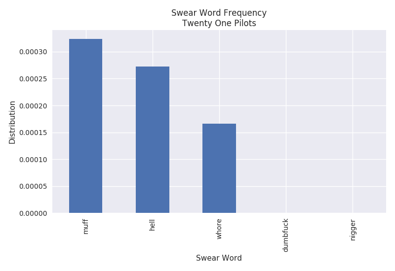
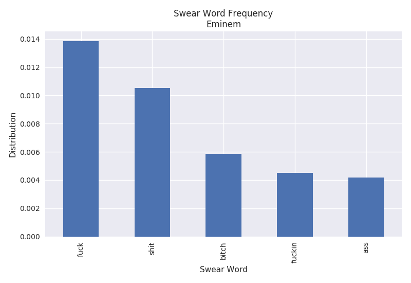
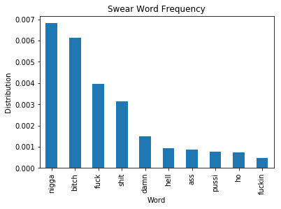
Swear Word Frequency

The swear word frequency is a measure of the number of curse words found throughout the lyrics. It is similar to the word frequency with the exception of curse words being targeted. The plots below only show the top 5 curse words found throughout the lyrics. It is pretty clear that Eminem curses quite a bit in his songs. The F-word shows up around 1.4% of the time. However, Twenty One Pilots only appears to curse very minimally with roughly 0.032% of the word "muff".

While we are only looking at the frequency of individual swear words, one might be interested in an overall frequency. For the purposes of this analysis it has been left out, but it could easily be calculated.
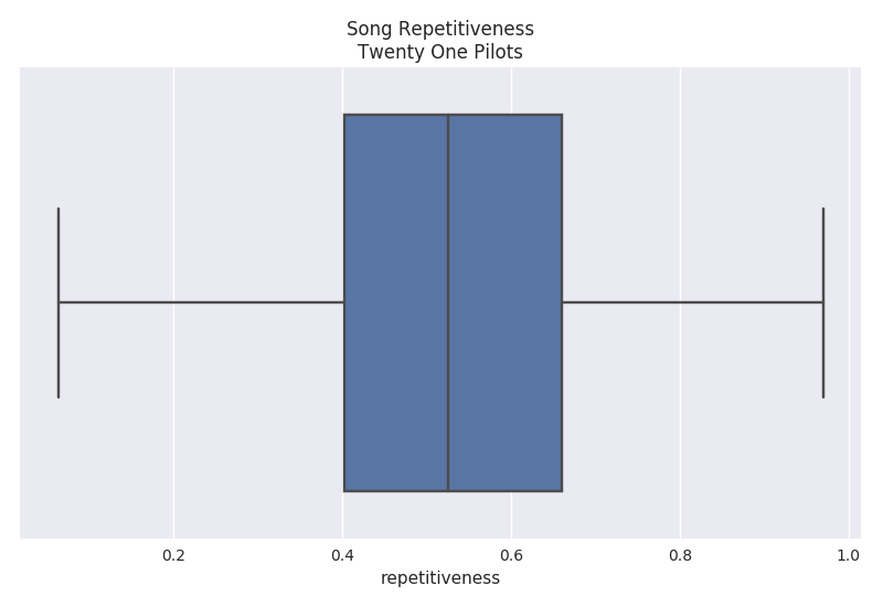
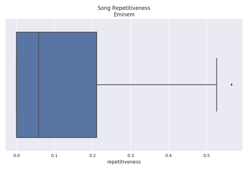
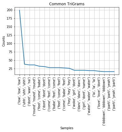
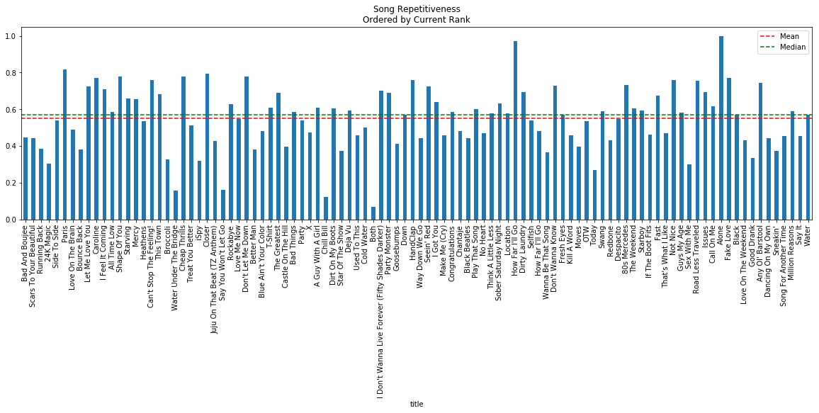
Repetitiveness

The repetitiveness is a measure of how many repetitions a particular phrase occurs. A threshold of 2 occurrences must be met in order for it to be considered repetitive. The actual calculation can be read within the Billboard analysis. The plots below show that Twenty One Pilots has a very high average repetition rate of 52% while Eminem has a much lower average rate of 7%.
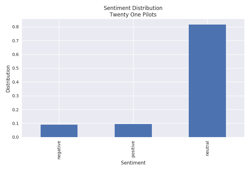
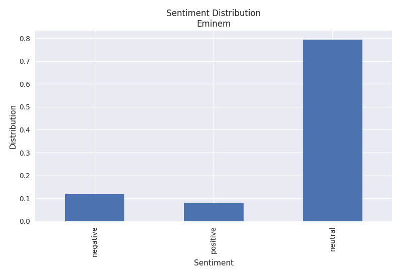
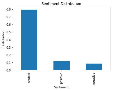
Sentiment

The sentiment algorithm used is Vader within the NLTK library. It is a rule based algorithm trained from Twitter data. The Twenty One Pilots plot shows that their songs consist of both positive and negative sentiments while Eminem's lyrics have a higher negative sentiment.
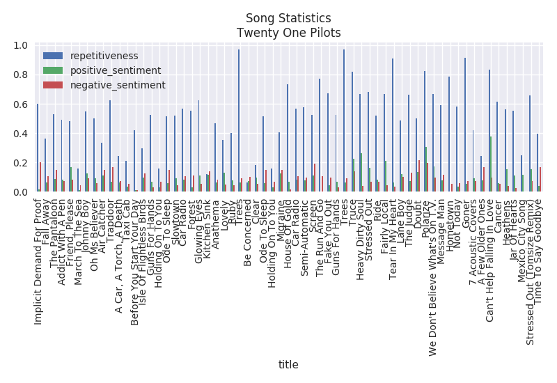
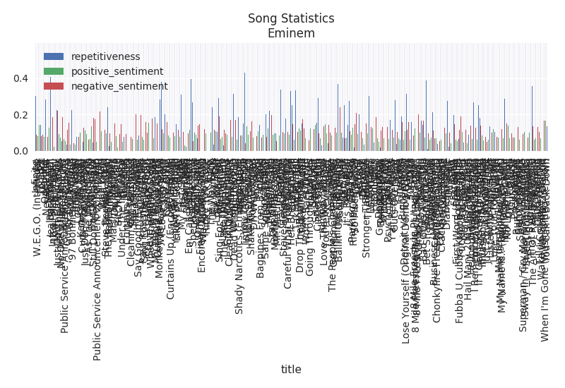
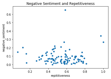
Song Statistics

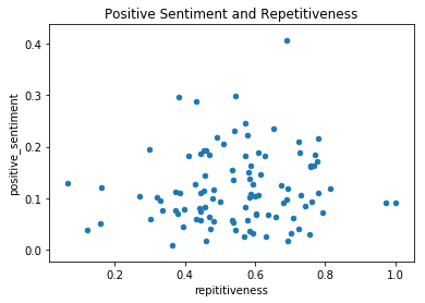
The song statistics simply plots the repetitiveness, positive sentiment and negative sentiment per song.
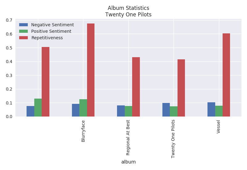
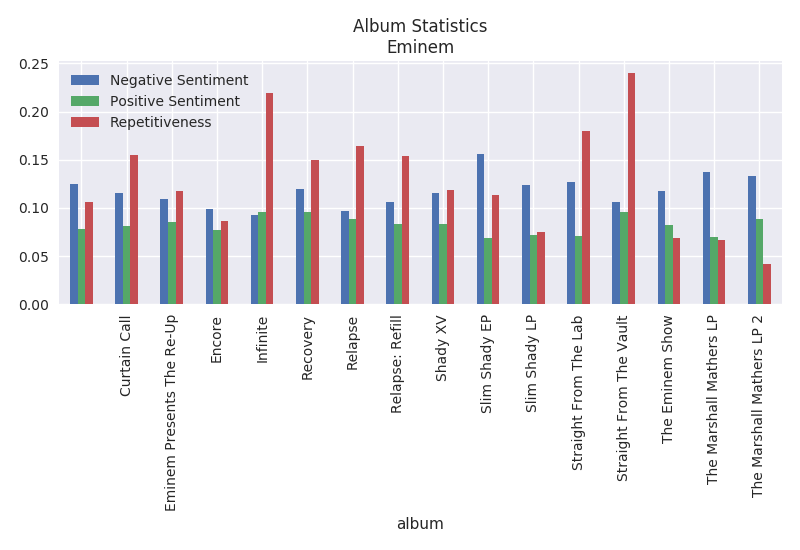
Album Statistics

The album statistics plots the repetitiveness, positive sentiment and negative sentiment per song. It is interesting that Twenty One Pilots highest repetitive album is Blurryface at a whopping 68%. The most repetitive album from Eminem is Straight From The Vault at around 23%.

Topic Modeling

The topic models shown below (one topic per line) is not very human friendly, however it makes sense to the computer. You can decipher a little bit of information from reading the topics. To build these topic models I used Sklearn. It extracted Ngrams from 1 to 2 N using the TfidfVectorizer within Sklearn and was fed into the algorithms. Essentially the vectorizer provides you with a list of features (Ngrams) and their inverse document frequency.

You can see that LDA and NMF give different results. LDA is typically used in documents where there are semantic units within the text while NMF is used for non-word based documents such as images.

LDA

Twenty One Pilots Topics

na na na ll tell reign
da hey hey hey trying trying trying
bah re broken bah bah broken doo
fall don heart won watch
save re alive stay alive eh eh

Eminem Topics

don cause shit fuck re
daddy phenomenal wanna love alright am phenomenal
paul rape don fuckin kidding ummm listened dead gay
yo requested intent checking week sayin called ok retilin goes
iâ canâ fucking kidding whatâ ish

NMF

Twenty One Pilots Topics

tell ll tell plans ll tell plans
na na na hello hello hello silent trees
hey hey hey trying trying trying trying sleep
sit sit silence silence car radio sit
play pretend pretend wish stressed re stressed

Eminem Topics

don cause shit fuck re
name name name huh hi yeah yeah
paul ummm listened paul ummm incest incest rape
woah alright drug woah woah steve
daddy mommy rejoice carry don voice looking

Conclusion

Building this data pipeline has proved to provide me with useful information about a particular artist without actually listening to any of their songs. One could use some of these techniques to identify music suited for a particular age or culture. For example, you may not want your kid to listen to songs with a high rate of swearing or negativity. Creating this type of intuition about a particular artist may enable individuals to quickly compare several artists at once with some adjustments to the pipeline. Some unsupervised clustering could be used in conjunction with the topic models to find similar artists based on lyrics.

Billboard Hot 100 Lyric Analysis

Introduction

The Billboard Hot 100, from billboard.com, is a list of rankings for the most popular 100 songs of a given week. The website claims to establish their rankings by "...fan interactions with music, including album sales and downloads, track downloads, radio airplay and touring as well as streaming and social interactions on Facebook, Twitter, Vevo, Youtube, Spotify and other popular online destinations for music." (billboard.com, 2017).

In this analysis the goal is to see if any trends appear within the song's lyrics through text analysis. This project was created purely out of personal interest to see if any lyrical patterns exist between popular songs. All of the code and data used during this analysis can be viewed at the following GitHub repository.

Please take caution while reading this blog post. Some offensive language is used for analysis purposes.

Methods

In this section we explore the methods and tools used to extract data from sources, clean the data and analyze the text.

Data Collection

The first task at hand was to determine which data sources provided the song list and the lyrics. Thankfully, billboard.com provided an RSS feed that could easily be parsed to process the top 100 songs for a given week while obtaining the lyrics was much more difficult. To parse the RSS feed, I used the Python programming language and the software libraries: LXML and Requests. LXML provides functionality to process DOM elements on web pages (HTML and XML). The Requests library enables you to create HTTP requests to obtain web content. 

The billboard.com RSS feed was obtained by making a GET request with the Request's library and further parsed using LXML. For every song in the RSS feed, the artist, title, rank this week, rank last week was collected. During the iteration of each RSS entry, a request to a lyric site was made to obtain the lyrics (discussed below). Once processed, a comma-delimited file was created to save the song entries. A simple illustration of this process is shown below.

Searching for websites that provided lyrics was the longest process in this whole project. There are several lyrics websites available, however many of them are community driven and do not always have every song's lyrics at hand. That created a challenge in creating a good combination of many different web sources to obtain lyrics from. AZLyrics.com, SongLyrics.com and LyricsFreak.com were all used to obtain lyrics. The process consisted of using the Requests and LXML libraries in the Python programming language. Essentially, the script would create a search request on each site until it found lyrics it was looking for. Once the lyrics were found it would extract them from the web page and save them to a text file. If one website did not have the lyrics, it would try the next one. If none of the sites contained the lyrics, it would raise an error. In the case of an error, manual web searching is required to obtain the lyrics. To create the file name for the lyrics file, I used the Python library unicode-sluggify.This library "sluggifies" the provided text replacing spaces with dashes and other symbols accordingly. It is normally used in creating "pretty" URLs.

In addition to the top songs and lyrics, I collected a set of swear words from noswearing.com. NoSwearing.com provides a list of swear words that are both common and uncommon. To extract these swear words I used the same libraries (Requests and LXML) to scrape data from the website. The website is laid out with all swear words separated alphabetically on their own web page. The script used to scrape the words iterated through the alphabet constructing the URL accordingly and fetched the swear words saving them to a text file.

Data Cleansing

Preparation of the lyrics files consisted of removing unwanted text within the files. Many of the files contained labels in brackets to mark the chorus and other constructs of a song. These were removed from the files. Additionally, some lyrics files had a line that consisted of "Produced by..." which was removed. All data cleansing techniques used regular expressions in the Python programming language. Prior to this data cleansing step, raw data analysis was performed to determine what was causing "dirty results".

Text Processing and Visualization

The Python language and the following libraries were used to process and visualize the text: NLTK, Pandas and Matplotlib. NLTK is a natural language processing tool kit that provides convenience functions for common tasks such as tokenization and sentiment analysis. The Pandas library is a tool that provides common data analysis features. It enables you to easily perform aggregations, obtain descriptive statistics and plot data by wrapping convenience methods from other libraries. When Pandas didn't provide the exact plotting styles that I wanted out of the box, I used Matplotlib functionality to add styling to the plots.

Analysis

In this section you will find the different analyses performed on the lyrics.

Word Frequency

One of the first analyses performed was to determine the frequency of words throughout the lyrics. This process was performed by tokenizing each of the words with NLTK, removing the stop words, stemming words with PorterStemmer, collecting word frequencies per lyrics file and normalizing the word frequency. Normalization was performed by treating each set of lyrics individually and collecting the frequency that each word showed up in the lyrics file individually. Once a frequency was obtained for each set of lyrics, a global frequency was calculated by combining all local frequencies and dividng by 100 (the number of songs). This method essentially treats every lyrics file as a "bag of words instead of all lyrics text combined as a "bag of words".

The bar chart above shows some of the common words used throughout the songs. The Y-axis is the frequency in a decimal percentage while the X-axis displays the words. So the word "love" shows up 1.5% of the time in all of the songs. Looking at the word frequencies could give you a general idea that "love" is a fairly popular topic in this set of songs.

Swear Words

The next analysis performed was to look at how frequent swear words occurred in the songs. The same process used to obtain the word frequency was used to calculate the swear word frequency with one additional step - filtering the words of interest. 

As illustrated in the plot, there is a very low frequency of swear words found throughout these songs. The most frequent swear word has a frequency of 0.7%. I imagine this is due to the nature of how billboard.com collects their information to create their list or songs with many swear words just are not as popular. Speculation aside, this would require more analysis and data collection on this specific topic to reliably determine the case.

N-Grams

Similar to looking at common words in the songs, I looked for common N-Grams. An N-Gram is a contiguous set of text. In this case our N-Grams represent a number of words.

The plot above shows the top TriGrams with their frequency.

The plot above shows the top BiGrams with their frequency. You might notice that there isn't a big difference between looking at TriGrams versus BiGrams. The majority of the same results show as the top. 

Sentiments

To gain insight into the general sentiment of these popular songs, the Vader sentiment analysis algorithm was used. This algorithm is a rule-based algorithm that was trained with Twitter data. It provides a good solution to handling slang and emoticons that isn't always seen in most algorithms. Another approach, given that I collectd more data, would be to create my own sentiment analysis tool using a NaiveBayes model. However, for this particular problem I felt that Vader would suffice. This is primarily due to no known source of lyrics with labeled sentiments.

I used the Vader algorithm on each individual line in a given lyrics file. The output of the algorithm is a probability score of neutrality, positivity and negativity. To obtain the sentiment for an entire song, each line was processed and the sum of each probability was gathered. Once all lines were processed, a normalized score was obtained by dividing by the total number of lines analyzed in the lyrics file. To obtain a global sentiment for all of the songs in the set, each song's sentimet scores were summed and divided by the total number of songs analyzed (100).

In this plot you can see that the songs are generally scored as neutral, however there is a 2-3% difference between positive and negative sentiments. I imagine that the sentiment analysis tool, Vader, is most likely not optimal for lyric analysis. Experimentation with other algorithms would need to be explored to determine if a better solution is available.

Repetitiveness

Have you ever listened to a song that seemed as if it was saying the same thing over and over again? Typically these songs become "stuck in your head" so I wanted to measure how repetitive a given song is. A custom algorithm was used to measure repetitiveness. Essentially, all unique phrases (each individual line) was obtained for each lyric file and a frequency for each phrase was calculated. All unique phrases that had 2 or more repetitions was summed together and divided by the total number of phrases in the file. The result is a percentage of repetitive lines.

A different approach for measuring repetitiveness would be at the word level. However, some songs use words in different phrases that may not sound repetitive. Either approach would work, however I felt that measuring at the phrase level made more sense. 

The plot above shows the percentage of repetitions found in each song. The songs from left to right are ordered by the 1st rank for the week to the 100th rank. You can also see that generally a lot of these songs are pretty repetitive with a median of nearly 58%. Althougth these songs may seem very repetitive, more data would need to be analyzed to get a better median and mean repetition percentage. In other words, it is difficult to say that these songs are very repetitive when we do not know how repetitive most songs are.

Correlations

I looked for trends between sentiments, current rank and repetitiveness. However, no strong correlations were found. The Pearson correlation was used to identify any potential correlations. Pandas provides a simple way to obtain all correlations in a table format between all numerical values. For illustration, I included some scatter plots.

Conclusion

While no correlations were found within the lyrics, many useful techniques and insights were gained in our analysis. We found that within our samples swearing is fairly limited with less than a 1% frequency, songs contain generally neutral sentiment with similar measures of positivity and negativity and that there appears to be a fairly high number of repititions in songs. 

Some things to take note of is that all of these songs come from different genres and artists which makes finding trends more difficult. Also, it may not only be lyrics that make a song popular.

Here is a list of further analysis topics that could be interesting:

  • Temporal analysis of Billboard Hot 100 songs across a year's period.
  • All songs for a particular artist.
  • Many songs from a particular genre.
  • Many songs from multiple genres treated as separate cohorts.
  • Improve sentiment analysis by training our own model. This would be very complicated with no labels.
  • Combine a songs audio and lyrics to perform a similar analysis.

Quick Stats - Descriptive Statistics Part 4 - Application of Mean, Median and Mode

Introduction

In the fourth part of our descriptive statistics series we will look at a real world application of the mean, median and mode. If you are unfamiliar with these concepts, please read parts 1, 2 and 3 of this blog series.

Quick Stats – Descriptive Statistics Part 1 – Mean
Quick Stats – Descriptive Statistics Part 2 – Median
Quick Stats – Descriptive Statistics Part 3 – Mode

Customer Ratings

Customer rating systems are used within ecommerce all of the time. They provide useful insights to customers on which items they would like to purpose. Imagine visiting Amazon.com. Typically you will try to find items that meet a particular price range and have good customer reviews.

Image courtesy of Amazon.com

The ratings are typically broken up into a 1 to 5 star system. Providing 1 star is the worst rating and providing 5 stars is the best rating. These ratings are broken up into a frequency table illustrating the number of ratings given. Additionally, we can see the average (mean) star rating. However, we do not typically see the median. Why do you think that is?

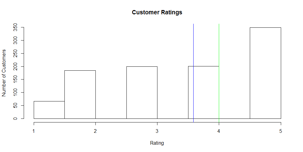
The plot above illustrates a histogram of customer ratings. It represents the frequency of ratings provided by each customer. The green line is the median and the blue line is the mean. This plot is not representative of the sample image above; it is random sample data that I generated in R (code below).

data <- rep(1, 66)
data <- c(data, rep(2, 184))
data <- c(data, rep(3, 200))
data <- c(data, rep(4, 201))
data <- c(data, rep(5, 349))

m = mean(data)
md = median(data)
hist(data, main="Customer Ratings", ylab="Number of Customers", xlab="Rating")
abline(v = m, col = "blue")
abline(v = md, col = "green")

Knowing that the median is 4 and the average is 3.583. Do you think it is important to know the median when deciding on a product to purchase? Probably not. If you remember our discussion on the mean and median, it is very context dependent on when to use one versus the other. Imagine if we only displayed the median. You would probably be more interested in purchasing this item.

Conclusion

Seeing a real world application of the mean, median and mode should provide you with more insight into these important descriptive statistics. Customer rating systems are used in ecommerce everywhere and the intuition behind them should be a little clearer. In the next blog post we will look at the standard deviation.

Contents © 2020 Tyler Marrs